You go to a website. There’s so much information and so many different menus that you aren’t sure where to start. You’re not sure what some of the menu items mean. You’re not even really sure what the organization does. Creating an easily scannable redesign where users knew what our client did and how to find their content was the focus of this project.
The Client
Resource Media is a PR firm intent on bringing more equity to our world through effective communication. This nonprofit communications agency creates campaigns for clients focused on social change. Over the last five years, Resource Media has grown and expanded their services and content beyond the scope of their original website. They also pivoted to focus more on visual and creative storytelling.
The Problem
Resource Media experienced rapid growth in their business, but did develop their website accordingly. They lacked organization, and they dumped projects and content into their website without modifying the structure to support their growth. This hindered their ability to expand the content and services they offered. As a result, users were getting lost in their content pages.
My Role
Omar Leung, the Project Lead, came to me with a problem: He had done the research and testing on this project and synthesized a plan and requirements for a new site, but he needed a designer for high-fidelity prototypes and wireframing. I stepped in to organize Omar’s ideas and findings into a layout that made sense visually and was easy for users to understand. This project lasted 1 week.
Themes
Based on his user research, Omar established some goals for the site redesign:
Theme 1: a simple, flat navigation menu with clear labels
Theme 2: connect real people with real insights and expertise
Theme 3: metadata on content pages that help users search and browse
Omar created this site map, which I used to influence my redesign:
Courtesy of Omar Leung / https://www.omarleung.com/
New Navigation + Labels
Using Omar’s new site map, I designed a new navigation menu. We incorporated a search bar in the top navigation menu and used contextual navigation to highlight the section our users were browsing. Next, we added breadcrumbs to each page, showing users where they were on the header menu.
We also add an overt description above the fold about what Resource Media does and who they work with. This, paired with a strong testimonial visible on the home page, made sure users knew what our client did and how they could be of service.
Content Categories and Metadata
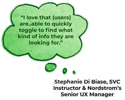
In both the ‘Journal’ and ‘Resources’ sections, we designed a static left navigation menu with categories, content type, and share buttons. The options can be toggled to narrow or widen the scope content. We included estimated time a user could consume each piece of content. I also designed new icons for all Resource Media’s content types.
The Resources page is a similar design, but with different selectable types. While the Journal page focuses on podcasts and insights, the Resources page has a lot more options for types. This is because Resource Media provides its clients with expansive resources, as is probably not surprising.
Resource Media Resources Prototype
I also redesigned the Journal content pages. I wanted to make the author relatable, so I included their portrait and a link to other articles they have written. Subscription and shareability are much more in the forefront on my version of this page, so it is easy to connect people with the insights and expertise of the author.
Discoverable and Expandable Content
Navigation is made easy with simple, flat menus and clear labeling. Users can hone in on their interests with a single click. Categories are readily discoverable via clear metadata on content pages. And by highlighting authors we emphasize that users are connecting to real insights and expertise.
My project manager was happy with my prototype. I was able to translate his ideas into a clear, visual designs that are easy for users to understand. I hope to continue working with him in the future!


